

Ready-made Style Panel
The core package ships a styled, framework-agnostic style panel so you don't have to build one by hand. It lives under the @linkurious/ogma-annotations/ui subpath and is completely optional — importing the main package entry stays headless and pulls in none of this code or CSS.
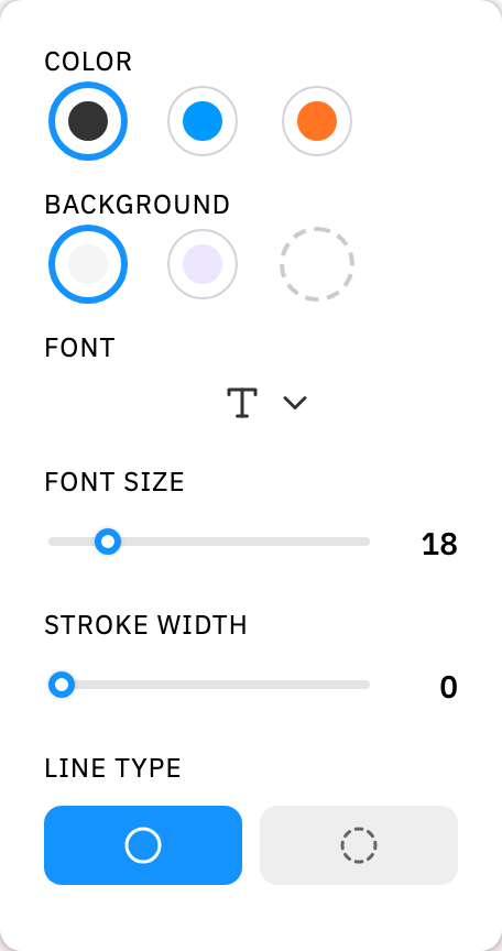
Installation
The panel is part of the package — no extra install. Import it from the /ui subpath and load the stylesheet once:
import { AnnotationPanel } from "@linkurious/ogma-annotations/ui";
import "@linkurious/ogma-annotations/ui/styles.css";
Why a separate subpath?
Keeping the UI on /ui means consumers who only want the headless editor pay nothing for the styled panel or its CSS. The icons are inline SVG, so there is no icon font to wire up.
Usage
Create the panel with your Control instance. The panel wires itself to the control's selection events: it appears when a single annotation is selected (after the click/drag settles) and hides otherwise. It creates and manages its own DOM inside the container you give it (defaulting to document.body).
import { Control } from "@linkurious/ogma-annotations";
import { AnnotationPanel } from "@linkurious/ogma-annotations/ui";
import "@linkurious/ogma-annotations/ui/styles.css";

const control = new Control(ogma);

const panel = new AnnotationPanel({
  control,
  container: document.getElementById("app")! // optional, defaults to document.body
});

// When tearing down:
panel.destroy();
The panel renders the right controls for the selected annotation type:
- Arrow — color, head/tail extremities, stroke width, line type.
- Text / Box / Comment — color, background, font, font size, stroke width, line type.
- Polygon — color, fill, stroke width, line type.
Editing a control calls control.updateStyle(...) for the selected annotation, so changes flow through the normal update path (including undo/redo).
Options
| Option | Type | Description |
|---|---|---|
control | Control | The annotation controller to bind to. |
container | HTMLElement (optional) | Element the panel mounts into. Defaults to document.body. |
placement | PanelPlacement (optional) | Which screen edge/corner the panel docks to. Defaults to "right". |
orientation | PanelOrientation (optional) | "vertical" (default) or "horizontal". |
Methods
| Method | Description |
|---|---|
show() | Show the panel. |
hide() | Hide the panel and close any open color picker. |
setPlacement(placement) | Change which edge/corner the panel docks to at runtime. |
setOrientation(orientation) | Switch between vertical and horizontal layout at runtime. |
destroy() | Detach all event listeners and remove the panel from the DOM. |
Layout
placement docks the panel to a screen edge or corner; orientation controls whether its sections stack vertically or run left-to-right as a toolbar. Both are applied as data-placement/data-orientation attributes and handled entirely in CSS — there's no inline positioning to fight.
import { AnnotationPanel } from "@linkurious/ogma-annotations/ui";

const panel = new AnnotationPanel({
  control,
  placement: "top-right",
  orientation: "horizontal"
});

// Change either at runtime:
panel.setPlacement("bottom-left");
panel.setOrientation("vertical");
PanelPlacement is one of "left", "right" (default), "top", "bottom", "top-left", "top-right", "bottom-left", "bottom-right".
PanelOrientation is "vertical" (default) or "horizontal".
Placing it inside a container
placement positions the panel relative to its nearest positioned ancestor — by default that's the viewport (via document.body). Pass a container with position: relative to dock corners/edges relative to that element instead of the whole page.
Theming
The stylesheet is driven by CSS custom properties. Override them on the panel (or any ancestor) to restyle without forking the CSS — the defaults preserve the out-of-the-box look:
.annotation-panel {
  --oa-accent: #0aa; /* active state, selected option, slider thumb, etc. */
  --oa-panel-bg: #fff;
  --oa-panel-radius: 10px;
  --oa-control-bg: #eee;
  --oa-text-color: #333;
  --oa-muted-color: #666;
}
The accent also falls back to a legacy --brand variable if you already set one in your app.
Building your own
The /ui subpath also exports the building blocks the panel uses, so you can assemble a custom panel or reuse pieces:
BACKGROUNDS,FONTS,EXTREMITY_OPTIONS,LINE_TYPES— the option config.initialRecentColors,withColorFromAnnotation,rgbaToString— recent-color state helpers.svgIcon,ICON_PATHS,IconName— the inline SVG icon set.attachPanelVisibility(control, { onShow, onHide })— the selection → show/hide state machine the panel is built on. Returns adetach()cleanup function.