

Context Toolbars
Small style pills — one per annotation type, like a context menu — that float next to the selected annotation, anchored to it (pans, zooms and rotates with the graph) instead of docked to a screen edge like the style panel. They live under the @linkurious/ogma-annotations/ui subpath, same as the panel and the toolbar — importing the main package entry stays headless.
| Type | Class | Built-in items |
|---|---|---|
| Text | TextContextToolbar | Color, Font, Font size, Bold, Outline, Show author, Delete |
| Sticky note | StickyNoteContextToolbar | Color, Font, Font size, Bold, Show author, Delete (no Outline) |
| Box | BoxContextToolbar | Color, Outline, Delete |
| Polygon | PolygonContextToolbar | Color, Outline, Delete |
| Arrow | ArrowContextToolbar | Outline, Delete (comment connectors excluded by default) |
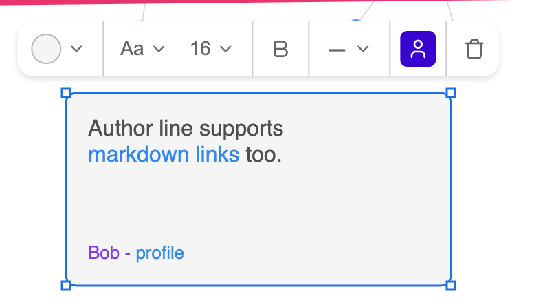
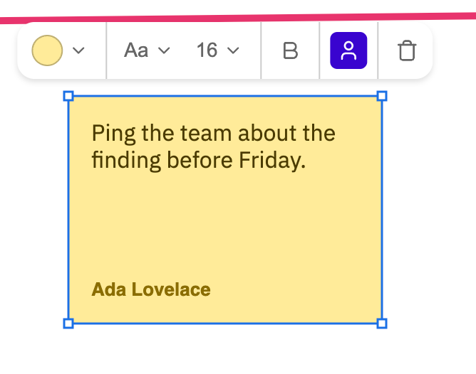
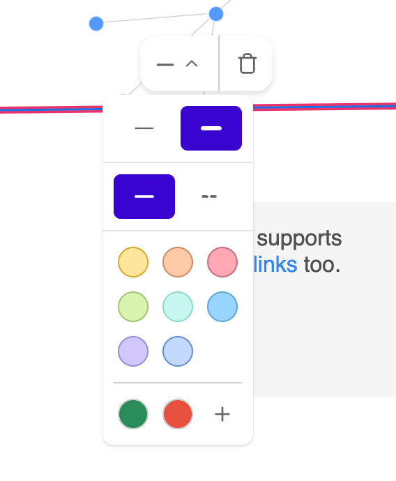
Comments have no built-in toolbar — see Toolbars for other annotation kinds.
Installation
Part of the package — no extra install. Import from the /ui subpath and load the shared stylesheet once:
import { ContextToolbars } from "@linkurious/ogma-annotations/ui";
import "@linkurious/ogma-annotations/ui/styles.css";
Usage
All types at once, with built-in defaults:
import { Control } from "@linkurious/ogma-annotations";
import { ContextToolbars } from "@linkurious/ogma-annotations/ui";
import "@linkurious/ogma-annotations/ui/styles.css";

const control = new Control(ogma);
const toolbars = new ContextToolbars({ control });

// When tearing down:
toolbars.destroy();
Every type is on by default. Pass false to turn one off, or an options object to configure it:
new ContextToolbars({
  control,
  box: false, // no pill for boxes
  text: { fontSizes: [12, 16, 24] },
  stickyNote: { swatches: MY_STICKY_SWATCHES },
  arrow: { items: (defaults) => defaults.filter((i) => i.id !== "delete") }
});
Or skip the orchestrator and set up only the types you want, one class each — ContextToolbars is exactly this, for all four:
import {
  TextContextToolbar,
  BoxContextToolbar
} from "@linkurious/ogma-annotations/ui";

const textToolbar = new TextContextToolbar({ control });
const boxToolbar = new BoxContextToolbar({ control });
Each toolbar shows itself automatically when exactly one annotation of its type is selected (same selection/debounce behavior as the style panel), and hides on unselect or drag. Nothing else to wire up: no container, no placement — its position is computed from the annotation's own geometry. If you also use the docked style panel, exclude the covered types from its enabledTypes so both don't show for the same selection.
In React, ContextToolbarsController (from @linkurious/ogma-annotations-react/ui) takes the same options as props.
Changing the fonts, sizes or color palette
Per-type options, one each — no subclassing. Shown here for Text; stickyNote takes the same fonts/fontSizes/swatches/onMoreColors:
const toolbars = new ContextToolbars({
  control,
  text: {
    fonts: [
      { value: "Georgia, serif", label: "Georgia" },
      {
        value: "IBM Plex Mono",
        label: "IBM Plex Mono",
        style: { fontFamily: "IBM Plex Mono" }
      },
      { value: "Comic Sans MS", label: "Comic Sans" }
    ],
    fontSizes: [10, 12, 14, 16, 20, 28],
    swatches: [
      { fill: "#FFE49B", stroke: "#D9A926" },
      { fill: "#C7F7EF", stroke: "#8CD9CC" }
    ]
  }
});fonts— options shown in the Font-family dropdown. Each is{ value, label, style? }:valueis the CSSfont-familywritten to the annotation's style,labelthe option's text, and the optionalstylean inline style hint for how that option previews in the list (typically{ fontFamily: value }, so e.g. a monospace option actually looks monospace). Defaults toDEFAULT_TOOLBAR_FONTS— Sans Serif, Serif, Monospace, IBM Plex Sans, IBM Plex Mono. As with any font, the actual webfont has to be loaded by your page (a<link>to Google Fonts,@font-face, etc.) for it to render as chosen — the toolbar just writes the CSS value, same asdefaultTextStyle/defaultStickyNoteStylealready do for"IBM Plex Sans"elsewhere in this package.fontSizes— plain numbers for the Font-size dropdown. Defaults toDEFAULT_TOOLBAR_FONT_SIZES([12, 14, 16, 18, 24, 32, 48, 64]).swatches—{ fill, stroke }pairs for the color cell's swatch grid (fillbecomes the annotation'sbackground;strokeis the swatch's ring color). Defaults toSTICKY_SWATCHES. Boxes and polygons take the same option.
Custom colors
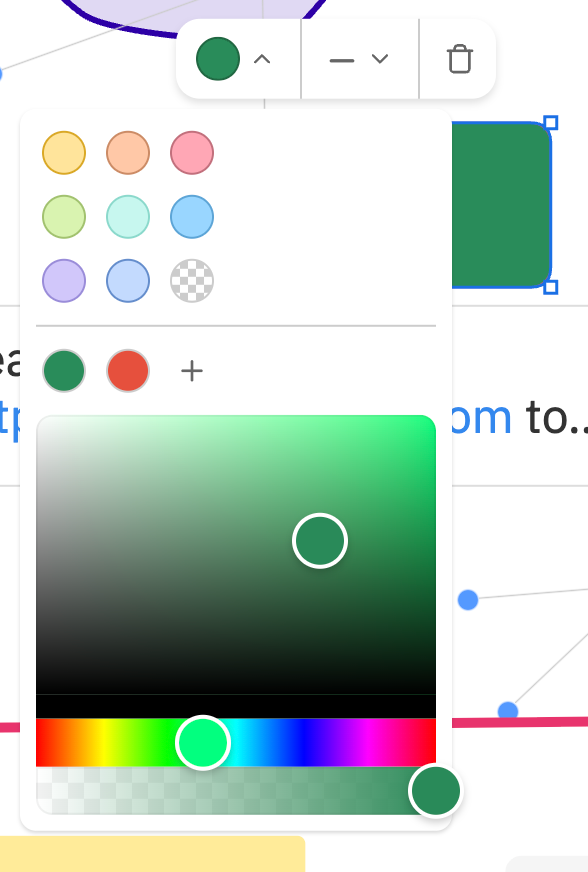
Every color dropdown (background and outline) shows the fixed swatches, then a row of custom colors ending in a + button. + opens the color picker; the color you settle on is added to the front of the custom row. The row keeps at most MAX_CUSTOM_SWATCHES (5) colors, newest first, no duplicates — the oldest drops off.
By default the custom colors are kept in memory, one list per Control, shared by every toolbar on it — a color added on a Text shows on Boxes too. Pass your own colorHistory to persist it, or to share/separate it differently:
import {
  createColorHistory,
  ContextToolbars
} from "@linkurious/ogma-annotations/ui";

const KEY = "my-app:annotation-colors";
const stored = JSON.parse(localStorage.getItem(KEY) ?? "[]");
const colorHistory = createColorHistory(8, stored); // keep up to 8
colorHistory.subscribe(() =>
  localStorage.setItem(KEY, JSON.stringify(colorHistory.get()))
);

new ContextToolbars({
  control,
  text: { colorHistory },
  stickyNote: { colorHistory },
  box: { colorHistory },
  arrow: { colorHistory }
});
Any object with get(), add(color) and subscribe(listener) works as a ColorHistory.
Your own color picker
Pass onMoreColors (background) or onMoreStrokeColors (outline) to open your own picker instead of the bundled vanilla-colorful one when + is clicked — a native <input type="color">, a design-system component, an app-wide color modal. Apply the color with ctx.updateStyle, and call addSwatch(color) to keep it in the custom row:
new TextContextToolbar({
  control,
  onMoreColors: (ctx, anchor, addSwatch) => {
    const current = ctx.getAnnotation().properties.style?.background;
    const input = document.createElement("input");
    input.type = "color";
    input.value = current?.startsWith("#") ? current : "#ffffff";
    input.addEventListener("input", () => {
      ctx.updateStyle({ background: input.value });
    });
    input.addEventListener("change", () => addSwatch(input.value));
    // `anchor` is the "+" button - position your own popover against it.
    anchor.after(input);
    input.click();
  }
});
The toolbar's own dropdown closes right before onMoreColors runs, so there's no double popover to manage.
Import the defaults from @linkurious/ogma-annotations/ui if you want to extend rather than replace them:
import {
  TextContextToolbar,
  DEFAULT_TOOLBAR_FONTS,
  DEFAULT_TOOLBAR_FONT_SIZES,
  STICKY_SWATCHES
} from "@linkurious/ogma-annotations/ui";

new TextContextToolbar({
  control,
  fonts: [
    ...DEFAULT_TOOLBAR_FONTS,
    { value: "Georgia, serif", label: "Georgia" }
  ]
});
Options
ContextToolbars
| Option | Type | Description |
|---|---|---|
control | Control | The annotation controller to bind to. |
hideWhenNotEditable | boolean (optional) | Default for every toolbar, see below. |
text | false | TextContextToolbarOptions | Plain Text pill. Omitted = defaults, false = off. |
stickyNote | false | StickyNoteContextToolbarOptions | Sticky-note pill. |
box | false | BoxContextToolbarOptions | Box pill. |
polygon | false | PolygonContextToolbarOptions | Polygon pill. |
arrow | false | ArrowContextToolbarOptions | Arrow pill. |
(Per-type objects omit control, which comes from the top level. A per-type hideWhenNotEditable overrides the top-level one.)
Every per-type toolbar
| Option | Type | Description |
|---|---|---|
control | Control | The annotation controller to bind to. |
items | (defaultItems, ctx) => ToolbarItem[] (optional) | Full control over the pill's contents. See below. |
hideWhenNotEditable | boolean (optional) | Whether a selected-but-locked (isEditable: false) annotation keeps the pill hidden, same as no selection. Defaults to true. |
filter | (annotation) => boolean (optional) | Narrows which annotations of this type get the pill, e.g. (a) => a.properties.tags?.includes("styled"). Defaults to all. |
colorHistory | ColorHistory (optional) | Custom colors behind the + buttons. Defaults to one in-memory list per Control. See Custom colors. |
Arrow
| Option | Type | Description |
|---|---|---|
includeCommentArrows | boolean (optional) | Also show the pill on an arrow attached to a comment. Defaults to false. |
Outline (Text, Box, Polygon, Arrow)
| Option | Type | Description |
|---|---|---|
strokeSwatches | Swatch[] (optional) | Outline cell's palette. Defaults to STROKE_SWATCHES. |
onMoreStrokeColors | (ctx, anchor, addSwatch) => void (optional) | Your own picker for the outline cell's +. |
Background color (Text, sticky note, Box, Polygon)
| Option | Type | Description |
|---|---|---|
swatches | Swatch[] (optional) | Color cell's palette. Defaults to STICKY_SWATCHES. |
onMoreColors | (ctx, anchor, addSwatch) => void (optional) | Your own picker for the color cell's +. |
Text and sticky note
| Option | Type | Description |
|---|---|---|
fonts | ToolbarDropdownOption[] (optional) | Font-family dropdown options. Defaults to DEFAULT_TOOLBAR_FONTS. |
fontSizes | number[] (optional) | Font-size dropdown presets. Defaults to DEFAULT_TOOLBAR_FONT_SIZES. |
Methods
| Method | Description |
|---|---|
destroy() | Detach all event listeners and remove the toolbar(s) from the DOM. |
Sticky notes vs. plain Text
A sticky note isn't a separate annotation type — it's a Text created via control.enableStickyNoteDrawing(). The toolbars tell them apart with isStickyNote() (exported from the main package entry, next to isText): TextContextToolbar shows for plain Text only, StickyNoteContextToolbar for sticky notes only, so each can be configured or turned off on its own.
The author toggle only flips a showAuthor display flag on the annotation's style for now; it doesn't render an author name anywhere yet (that format — who, and where it's stored — isn't decided).
Beyond fonts/sizes/colors: rearranging or replacing items
fonts/fontSizes/swatches cover the common case. For anything more - drop the Delete button, add a new action, reorder the whole row - pass items, available on every type. It's called with that type's built-in list and returns what actually renders - add, remove, reorder or replace freely, no subclassing needed:
const toolbar = new TextContextToolbar({
  control,
  items: (defaultItems, ctx) => [
    ...defaultItems.slice(0, -2), // everything except the trailing separator + Delete
    { kind: "separator" },
    {
      kind: "button",
      title: "Export as SVG",
      icon: "camera",
      action: (c) => exportAnnotationAsSvg(c.getAnnotation())
    }
  ]
});
Each built-in entry carries a stable id ("color", "font", "fontSize", "bold", "outline", "showAuthor", "delete") so you can address one without relying on array position - safe even if a later version adds to or reorders the built-in list:
items: (defaultItems) => defaultItems.filter((i) => i.id !== "delete");Each entry is one of:
{ kind: "button", id?, title, icon, action, isActive?, danger? }— a plain action or toggle button (this is what Bold/Delete/the author toggle are).{ kind: "dropdown", id?, title, options, getValue, onSelect, getLabel? }— a "pick one of a list" cell (Font family/Font size).{ kind: "separator" }— a divider. There's no automatic spacing between items - the list controls layout explicitly, dividers included.{ kind: "custom", id?, build: (ctx) => cell }— an escape hatch for anything that doesn't fit the two shapes above: a hand-builtToolbarCell(element/update()/destroy()). The color cell (a swatch grid opening a secondary picker popover) uses this.
icon is any name from the shared icon set (IconName, exported from @linkurious/ogma-annotations/ui) — the same hand-copied SVG paths used throughout the panel and toolbar, no icon font required. For anything else (like a lock glyph, in the example below) build the cell's own <svg> inline instead - see kind: "custom".
items covers everything a subclass used to be needed for. Subclassing (extend ContextToolbar, implement matches() and defaultItems()) is only worth reaching for to add a toolbar for a new kind of selection - items is the right tool for "different buttons."
Worked example: a "lock" button that blocks drag/edit and greys out the rest
isEditable(annotation) (a Control option) decides whether an annotation can be dragged, resized, restyled, text-edited, deleted or re-linked - this is the actual enforcement; the toolbar only decides what's shown.
Keep the locked-ids set outside the annotation's own data - don't try to store it as an annotation field. isEditable gates every write that goes through control.update()/updateStyle(), evaluated against the annotation's state before that write applies - so a locked flag living inside properties could never unlock itself: the very call that sets locked: false would already be vetoed, since at the moment it runs the annotation is still locked. (Worth confirming yourself before relying on it - control.update({ id, properties: { locked: false } }) against an annotation whose isEditable currently returns false logs Cannot update annotation <id>: not editable and is a no-op.) A plain Map, read by the predicate and written directly by the lock button, sidesteps the gate entirely and still applies uniformly across every annotation type - Text, Arrow, Box, Polygon, Comment alike, not just TextStyle:
import type { Id } from "@linkurious/ogma-annotations";

const locked = new Map<Id, boolean>();

control.setOptions({
  isEditable: (annotation) => !locked.get(annotation.id)
});
The button. Nothing here changes annotation data, so nothing else triggers a re-render on its own - the click handler refreshes the button (and the grey-out class) itself, right after mutating locked:
import type {
  ToolbarCell,
  ToolbarCellContext
} from "@linkurious/ogma-annotations/ui";
import type { Id } from "@linkurious/ogma-annotations";

const LOCK_ICON =
  '<rect x="3" y="11" width="18" height="11" rx="2"/><path d="M7 11V7a5 5 0 0 1 10 0v4"/>';

class LockCell implements ToolbarCell {
  readonly element = document.createElement("button");

  constructor(private ctx: ToolbarCellContext) {
    this.element.type = "button";
    // oa-lock-button is a hook for the CSS below, not a styling class of
    // its own - oa-toolbar-button is what actually makes it look right.
    this.element.className = "oa-toolbar-button oa-lock-button";
    this.element.innerHTML = `<svg xmlns="http://www.w3.org/2000/svg" width="16" height="16" viewBox="0 0 24 24" fill="none" stroke="currentColor" stroke-width="2" stroke-linecap="round" stroke-linejoin="round">${LOCK_ICON}</svg>`;
    this.element.addEventListener("click", this.onClick);
  }

  private onClick = () => {
    const id = this.ctx.getAnnotation().id;
    locked.set(id, !locked.get(id));
    // Applies the new lock state immediately: a handler is normally
    // (de)attached only when the selection changes, so without this an
    // already-open editor (or an in-progress drag) on this still-selected
    // annotation would keep working until it's deselected and reselected.
    control.editFeature(id);
    this.refresh(id);
  };

  update(annotation: { id: Id }) {
    this.refresh(annotation.id);
  }

  private refresh(id: Id) {
    const isLocked = locked.get(id) === true;
    this.element.classList.toggle("active", isLocked);
    this.element.dataset.tooltip = isLocked ? "Unlock" : "Lock";
    // Grey out every other cell in the pill - see the CSS below.
    this.element
      .closest(".annotation-style-toolbar")
      ?.classList.toggle("locked", isLocked);
  }

  destroy() {
    this.element.removeEventListener("click", this.onClick);
  }
}/* Every direct child of the pill except the lock button and dividers -
covers Bold/Delete/the color swatch/the Font dropdowns alike, whatever
kind of cell they are, since they're all direct children of the same
row. */
.annotation-style-toolbar.locked
> *:not(.oa-lock-button):not(.oa-toolbar-separator) {
opacity: 0.4;
pointer-events: none;
}Wire it together with items and hideWhenNotEditable: false - the latter is what keeps the pill open (greyed out) on a locked selection instead of disappearing, which is the default (matches the docked style panel's behavior too):
const withLock = (defaultItems: ToolbarItem[], ctx: ToolbarCellContext) => [
  { kind: "custom", id: "lock", build: () => new LockCell(ctx) },
  { kind: "separator" },
  ...defaultItems
];

const toolbars = new ContextToolbars({
  control,
  hideWhenNotEditable: false,
  text: { items: withLock },
  stickyNote: { items: withLock }
});
That's the whole feature - no subclass, no custom show/hide wiring. The docked AnnotationPanel takes the same hideWhenNotEditable option if you want a locked annotation's panel to behave the same way there.
Worked example: placing the lock item next to Delete instead of first
The example above prepends Lock, ahead of Color - fine as a default, but say you want it grouped with Delete instead, at the end of the row rather than the start. Same LockCell from that example, unchanged - only where items places it in the returned array differs, by finding "delete"'s index instead of spreading defaultItems wholesale:
items: (defaultItems, ctx) => {
  const lockItem = {
    kind: "custom" as const,
    id: "lock",
    build: () => new LockCell(ctx)
  };
  const deleteIndex = defaultItems.findIndex((i) => i.id === "delete");
  return [
    ...defaultItems.slice(0, deleteIndex), // color…showAuthor, plus the separator right before Delete
    lockItem,
    { kind: "separator" },
    ...defaultItems.slice(deleteIndex) // Delete itself
  ];
};
Renders as […] [showAuthor] | [Lock] | [Delete] - deleteIndex still points at the right item even if a later version inserts something new earlier in the built-in list, which is exactly what addressing by id instead of a hardcoded array index buys you here.
Toolbars for other annotation kinds
Extend ContextToolbar — say which annotations it applies to and what its default items are. Selection, placement and items/filter/ hideWhenNotEditable come with it:
import {
  isComment,
  type Annotation,
  type Comment
} from "@linkurious/ogma-annotations";
import {
  ContextToolbar,
  deleteItem,
  type ToolbarItem
} from "@linkurious/ogma-annotations/ui";

class CommentContextToolbar extends ContextToolbar<Comment> {
  protected matches(a: Annotation): a is Comment {
    return isComment(a);
  }
  protected defaultItems(): ToolbarItem<Comment>[] {
    return [deleteItem()];
  }
}

new CommentContextToolbar({ control });
All context toolbars on one Control share a single selection watcher, so adding more of them costs no extra event handling.
Dropdowns stay on screen
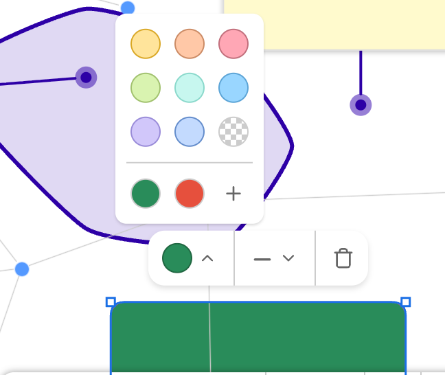
A toolbar's dropdowns open below their button, flip above it when there's no room below, and shift sideways to stay inside the Ogma container (clipped to the browser window) — same as the pill itself. A custom cell can read that area from ctx.getBounds().
Theming
The pill uses its own --oa-toolbar-* CSS custom properties, alongside the --oa-accent token shared with the style panel and toolbar:
.annotation-style-toolbar {
  --oa-accent: #0aa;
  --oa-toolbar-bg: #fff;
  --oa-toolbar-radius: 12px;
  --oa-toolbar-shadow: 0 2px 4px rgba(0, 0, 0, 0.12);
  --oa-toolbar-divider: #d5d7da;
  --oa-toolbar-tooltip-bg: #303030;
  --oa-toolbar-tooltip-fg: #fff;
}
See Also
- Style Panel — the docked, all-annotation-types editing panel
- Toolbar — the drawing/undo-redo toolbar
- Text Styles — the underlying
TextStyleproperties
Migrating from TextAnnotationToolbar
TextAnnotationToolbar (and its flat options) still works but is deprecated - it maps onto ContextToolbars, with items applied to the Text and Sticky-note pills only:
// before
new TextAnnotationToolbar({ control, fontSizes: [12, 16], items });
// after
new ContextToolbars({
  control,
  text: { fontSizes: [12, 16], items },
  stickyNote: { fontSizes: [12, 16], items }
});
Old class names are kept as deprecated aliases: TextStyleToolbar → TextContextToolbar, StickyNoteStyleToolbar → StickyNoteContextToolbar, AnnotationStyleToolbar → ContextToolbar. Their constructor now takes only options (they track selection themselves) instead of (options, annotation).